The Best Android Launcher
While hardware has progressed in leaps and bounds, in my opinion, the basic interface and launcher metaphor for the Android operating system has remained woefully behind the times. I've frequently found myself flipping through screens of icons and applications unable to quickly find an application I'm looking for. It usually happens when I'm standing in front of someone and trying to reflexively launch an app, or take a note, or send a message, or some other activity in a hurry.
I think Microsoft may have been on to something with their 'tile pattern' Windows phone.
What I want, and have nearly been able to create in a launcher setup is the following:
- I want the main UI of the launcher to reflect the importance I place on the applications I use. Important and more frequently used applications should be larger, and more prominent. I should be able to arrange this myself.
- I want other important widgets and sources of information to be shown on the home screen as well - time, weather, calendar.
- I want all other applications to be available from a single search interface, where the applications are ordered by frequency of use (not last used, but frequency of use over time) - and I want this to be a single view available from a single screen tap - with the keyboard shown and the search input field ready for a single or at most two letter input to filter the view (I really don't want to have to press again to activate the keyboard).
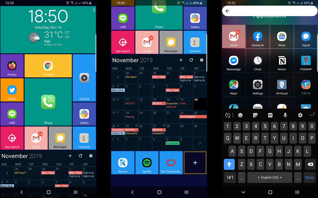
And so here's how I achieved the above. I installed 1) Square Home 3 Launcher and 2) Chronos Widgets and 3) Business Calendar 2
In the image above you can see three screen captures. The first two show my home screen - with Square Home 3 configured with Chronos widgets at the top, my 'tiled' and customized application icons in the middle, Business Callendar 2 widget below, followed by a few less frequently used applications. The third screen capture shows what happens if you press the Square Home 3 App Search icon. A list of applications appear - ordered by frequency of use, with the search input field active and the keyboard up. Perfect. I can find any app that's not on my home in less than a second - no matter how rushed or flustered I may be.
I wish none of this was necessary. I'd rather not have to spend the hour or so it takes me to configure a new phone. It would be great if one of the major vendors valued my productivity as much as I do and offered a 'default' launcher that was configured just like this - albeit a little slicker, and more integrated.
Although we use Apple devices for development at work, I feel iOS has also fallen behind in terms of the overall user experience and their user interface (in particular their development environment) - although their home screen and launcher is still far more polished than Android. It's a space ripe for revolution.
Add new comment