Theme Switching for Storybook Dark Mode and Tailwind
[Update 2023-06-15] Updated to show how this can all be done with the @storybook/addon-styling plugin, and withThemeByClassName as opposed to withThemeByDataAttribute .
Here's a short PSA on how to quickly add a dark mode theme switcher to Storybook - without the use of a plugin.
Before we begin - there _is_ what appears to be an excellent plugin here https://storybook.js.org/addons/storybook-tailwind-dark-mode, which will use the default darkMode: 'class' setting in tailwind.config.js - and so this might just be the better option. ;-)
1) Configure Storybook for Tailwind support - here - https://storybook.js.org/recipes/tailwindcss
2) Next - configure Preview.{jsx,tsx} as follows...
import React from 'react'
import type { Preview } from '@storybook/react'
import '../src/styles/tailwind.css'
import { withThemeByClassName } from '@storybook/addon-styling'

const globalDecorator = (StoryFn, context) => {
  const theme = context.parameters.theme || context.globals.theme
  console.log(theme)
  return (
    <div
      style={{
        position: 'absolute',
        top: 0,
        left: 0,
        width: '100vw',
        height: '100vh',
        padding: '12px',
        overflow: 'auto',
        backgroundColor:
          theme == null || theme.length === 0 || theme === 'light' ? '#ffffff' : '#222233',
      }}
    >
      <StoryFn />
    </div>
  )
}

export const decorators = [
  globalDecorator,
  withThemeByClassName({
    themes: {
      light: 'light',
      dark: 'dark',
    },
    defaultTheme: 'light',
  }),
]

const preview: Preview = {
  parameters: {
    actions: { argTypesRegex: '^on[A-Z].*' },
    controls: {
      matchers: {
        color: /(background|color)$/i,
        date: /Date$/,
      },
    },
  },
}

export default preview
3). Change the darkMode detection method of Tailwind to...
darkMode: "class",
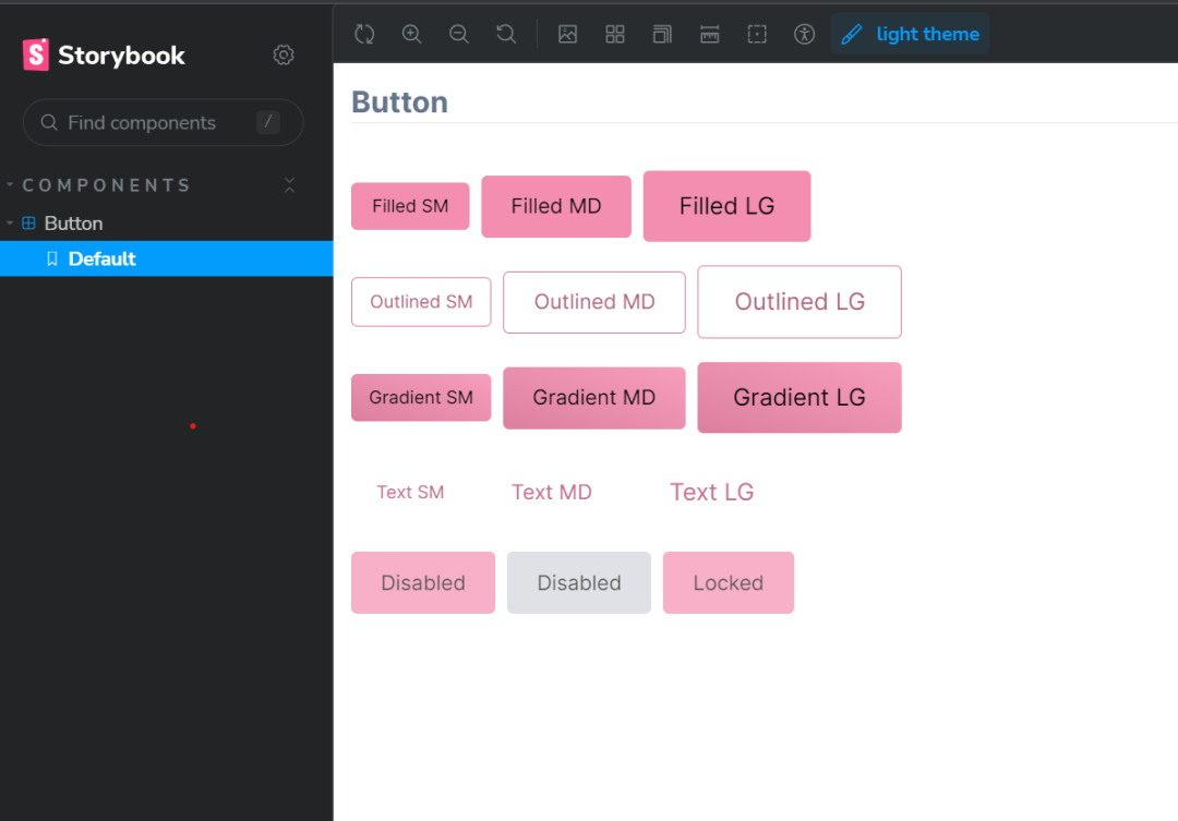
... and you should be good to go. Again, the Tailwind plugin above is likely the better solution, but this works as well and you'll have a nice theme switcher in the toolbar as follows...
Add new comment